

Hong Kong's public bodies tend to write carefully and design carelessly. Word choice gets scrutinised; layout and charts often don't. Some large government projects have started to close that gap—the Northern Metropolis Development Strategy Report dropped the gradient backgrounds that used to be everywhere—but roughly designed official briefings and data slides are still the norm.
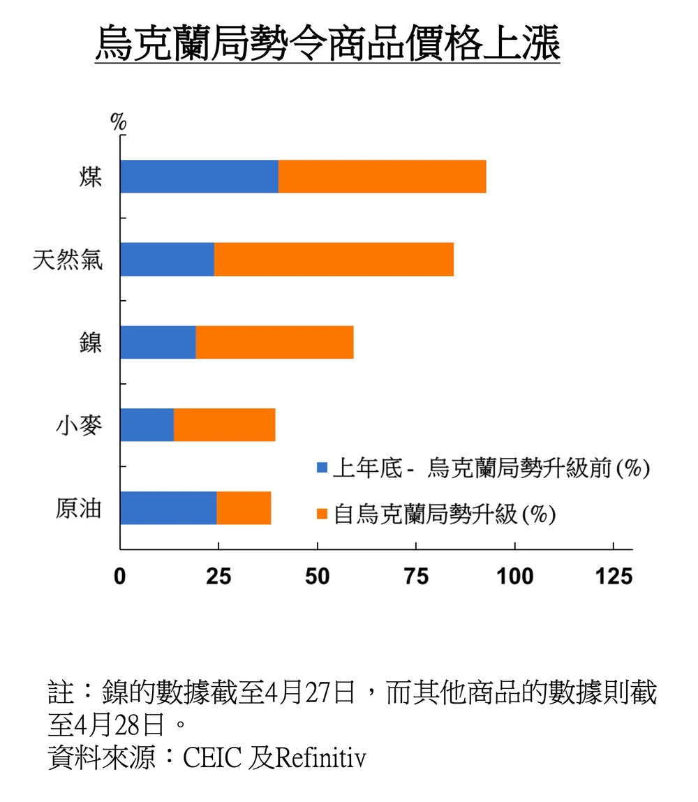
In May 2022, the Hong Kong Monetary Authority (HKMA) submitted a 37-page briefing to the Legislative Council's Financial Affairs Panel. There's plenty to pick at across those 37 pages, but we'll focus on a single chart and work through what's wrong with it—and how we'd fix it.
01 You can't just add two percentages
Setting colour and typeface aside for a moment—the whole briefing runs on a plain white background, black Times-style body text, and a chart in exactly the two colours you get by default from Microsoft Office, #ED7D31 and #4472C4. Cosmetic choices like these are the easy part to fix. The harder question is whether the chart communicates its point at all.
The core message is that commodity prices were already rising briskly before the Ukraine war escalated, and rose sharply further afterward. The HKMA chose to represent the two periods as two stacked segments of colour. The problem: if coal rose 100% before the escalation and another 100% after, the price hasn't risen 100% + 100% = 200%. It's risen to four times its original level—a 300% increase—because the second jump compounds on top of the first, it doesn't add to the original base. Stacking two percentage changes on top of each other and reading off the combined bar length isn't just unclear, the total it implies is mathematically wrong.
02 A legend that needs a paragraph to explain itself
There's a second, more charitable reading: maybe the HKMA meant the two segments stacked together, blue plus orange, to represent the total rise from last year-end to now. If that's the intent, the legend for the second segment—"since the escalation of the Ukraine situation (%)"—is worded incorrectly, since taken literally it means the change is measured from the escalation date as its own baseline, not from year-end. Explaining what the legend actually means takes a paragraph. That's usually a sign a clearer chart exists: if a legend needs this many words, redesign around the confusion instead of writing your way out of it.
03 A stacked bar answers a different question
There's an established convention for showing price movement over time in financial media: the line chart you see constantly in newspapers and on TV, price on the y-axis, time on the x-axis. Putting commodity categories on the y-axis and percentage change on the x-axis, the way the HKMA's briefing does, isn't wrong by itself—CNBC's own Market Movers page uses a similar horizontal-bar layout. But that layout is built for ranking: which stock moved the most today, which the least, read off top to bottom. The HKMA's chart isn't trying to rank commodities against each other—its subject is that all of them kept climbing over time. A ranking-shaped chart doesn't fit a duration-shaped story.
04 What a line chart shows that a stacked bar can't
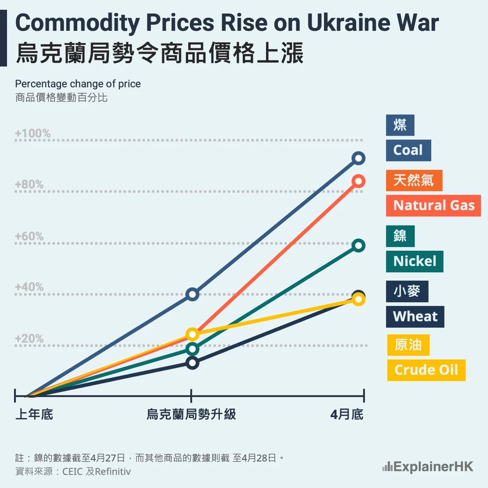
A price line chart's real advantage is that it shows the effect of time passing. How long was it from last year-end to the escalation of the war? How long has it been since? The HKMA's chart never says, and a reader has no way to tell which of the two periods saw faster price growth. Comparing the rate of change over a period is exactly what a stacked bar chart is poorly suited to show, and exactly what the slope of a line communicates automatically.
05 Three elements, one shared baseline
Making any data graphic starts with naming the elements the story actually needs. Here there are three: the commodities themselves (coal, natural gas, nickel, wheat, crude oil), time (year-end, the escalation of the war, now), and price change. Once those three are named, we redrew the chart as a line chart, indexing every commodity to the same starting point—last year-end. Visually, a reader immediately sees all five commodities share one starting line, with no legend required to explain it. Each commodity gets its own coloured line, and the slope of that line shows the speed of its price change at a glance.
06 What we'd still want to add
We redesigned how the data is represented, but the underlying chart would be sharper still with actual calendar dates rather than the vague "year-end," "escalation," and "end of April" labels the HKMA's own briefing uses—that's a limitation of the source data, not something a redesign alone can fix. Purely as a polish item, a small icon next to each commodity's name, to the left of its label, would make the chart a little faster to scan.
07 Don't let "Recommended Charts" make the decision for you
If we had to guess how the original chart came together: someone likely downloaded the data into an Excel table, listing five commodities against two time periods, then clicked Excel's Recommended Charts and accepted whatever came up. We like Microsoft Office as much as anyone—it's powerful, and building a chart in it is genuinely easy. That ease is exactly the problem. Because making a chart takes so little effort, data that's really shaped like a table often gets converted into a chart without anyone asking whether a chart is the right format at all.
A table and a chart are both ways of telling a data story, but they're not interchangeable. To build the line chart above, we couldn't just reformat the HKMA's existing table—we had to add a new column, turning two time periods into three time points, and backfill a zero for every commodity at the year-end starting line. That extra step is exactly the kind of thing "Recommended Charts" skips over, and exactly why it's worth doing by hand.
More from the studio



Send it our way
Rough draft, messy spreadsheet, or a chart you inherited and don't quite trust—we're glad to take a look.
Get in touch