Lessons from years of client work on why charts mislead, and how to make data honest.
Most decks are judged twice: live in the room, then as a PDF skimmed afterwards. We rebuilt the first five pages of a real investor deck for both.


A shipping company's fuel-price chart, redone: cut the data, link two charts with one colour, and design the page to scroll well as a PDF.

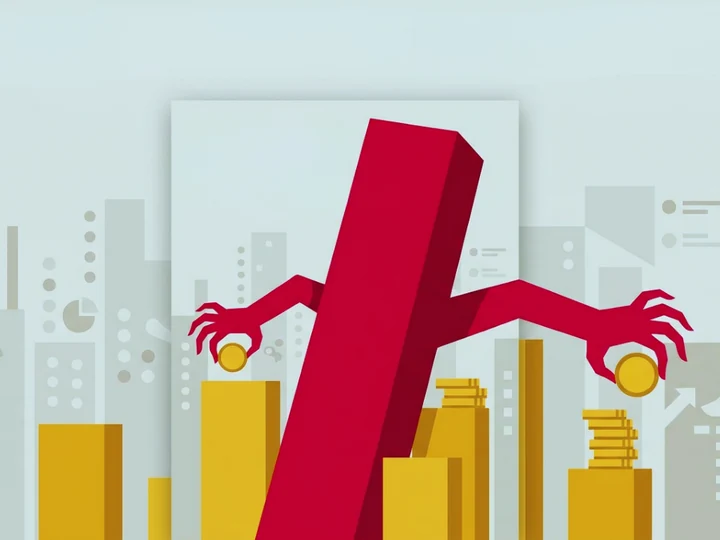
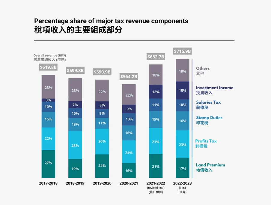
A casino operator's results chart crams a quarterly total and a six-way breakdown into one stacked bar. Here's why it fails and how to split it.

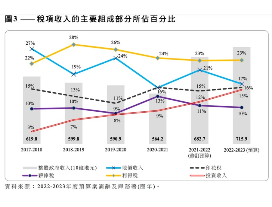
A government briefing stacks two price jumps as if percentages simply add up. See why a simple line chart tells the story better.

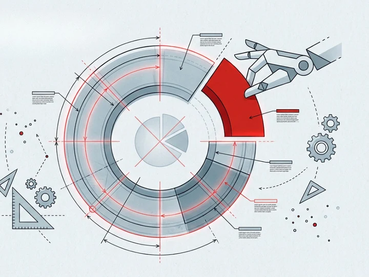
A 3D exploded pie is colourful but hard to read. Here's how we'd turn it into a clear donut, with ordering, labels and colour tips.

For Manulife, FWD, Greenpeace, Médecins Sans Frontières and more — most taken end-to-end, from research and angle to final design.
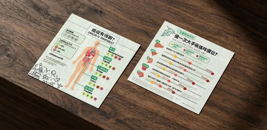 Infographic
Starting from a clean slate, we researched the topic, found a factual yet persuasive angle, and designed the finished piece.
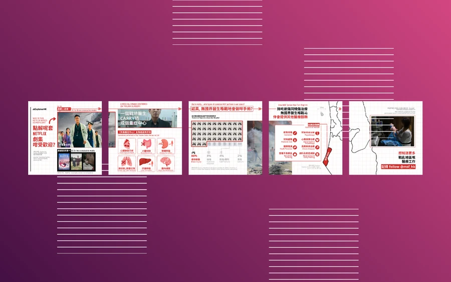 Animated infographic
We used a popular drama as the angle to make MSF's work feel less distant and more engaging.
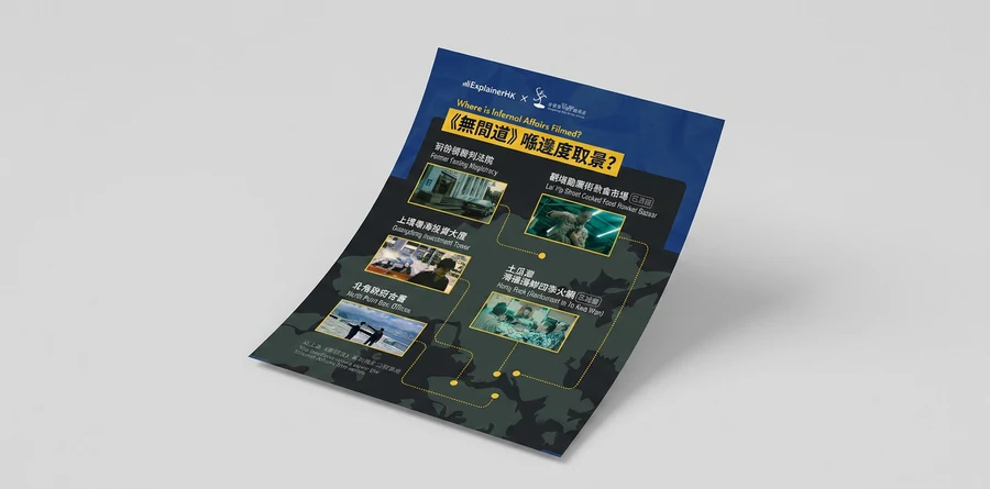 Infographic
The movie needed no introduction—so we found a playful way in, aimed at drawing people to the festival.
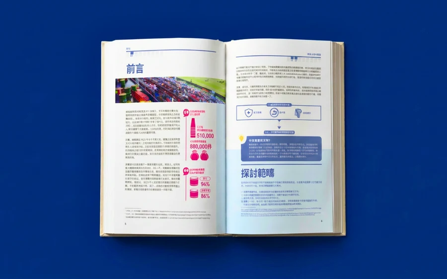 Report Design
Starting from a text-and-figures draft, we identified what could become charts—and designed the report around them.
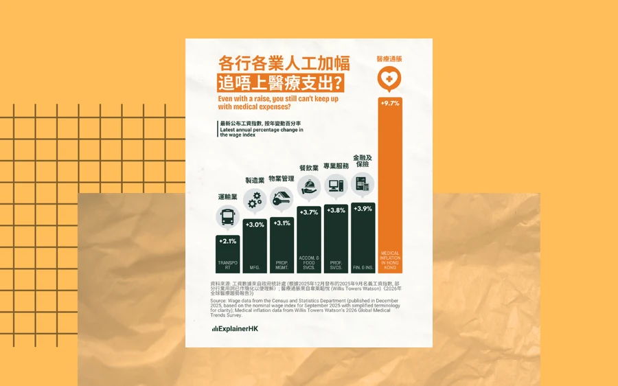 Chart
Chart
We dug out the surprising distance between wage and medical inflation to make the need for cover feel real.
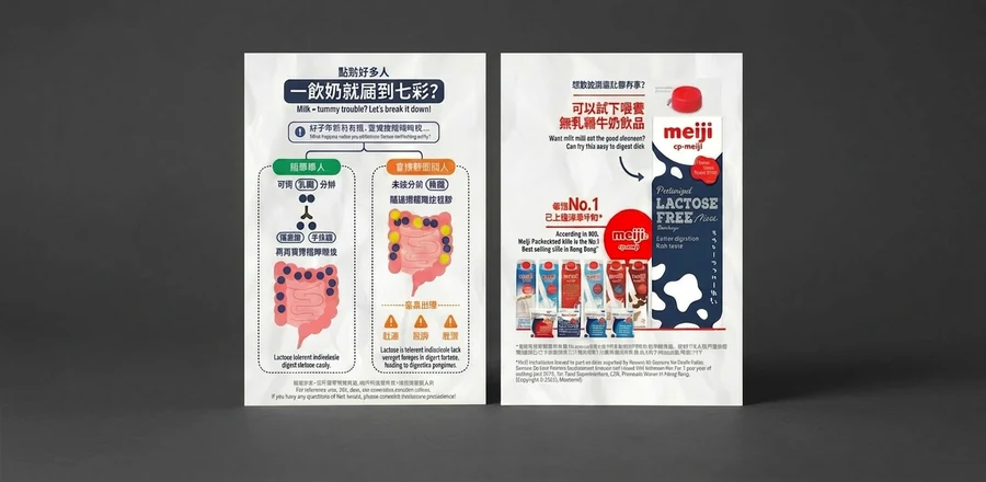 Infographic
We balanced education with selling, simplifying both the diagrams and the language behind lactose intolerance.
AI can turn a spreadsheet into a chart in seconds. What it can’t do is decide what the data actually says, who it’s for, and how to show it without misleading anyone. That judgement is what clients bring us in for — on a screen people can explore, a page or a slide.

Calculators, dashboards and explorable charts that let people find their own answer — with honest baselines and a clear angle.
We find the one thread that holds the story together, then design around it.
Structure, hierarchy, and a consistent system across your deck — designed for the room, not just the screen.

Hands-on sessions on the decisions behind good charts — not just how to use the tools.
Send us your dataset, chart, deck or report, who it’s for and when you need it. Whether it becomes an interactive tool, a dashboard or a sharper chart, we’ll suggest a clear next step.
Prefer email? info [at] explainerhk.com