

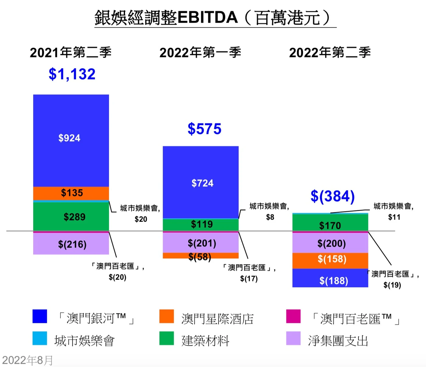
Charts made by private companies usually go through a professional marketing or investor-relations team, so they tend to look sharper than what public bodies put out. But a quick look through Hong Kong-listed companies' filings shows plenty of exceptions. This time we picked a chart from Macau casino operator Galaxy Entertainment Group's own second-quarter and interim results presentation.
We chose this one specifically because it shows a mistake that has nothing to do with taste or default colours: the chart tries to show two different numbers at once, and ends up representing neither of them clearly.
01 Mixed positive and negative numbers, no shared baseline
A bar chart works because a reader can compare bar lengths at a glance without reading a single number. Galaxy's chart undermines that immediately: the bars for the three quarters don't sit on the same horizontal line, so without reading the labels, there's no reliable way to compare them by eye.
It gets worse. Each bar is built from six business-unit segments, some positive and some negative. The bar's total height doesn't represent any real figure—if it means anything at all, it's what you get by treating every negative segment as if it were positive and adding the results together, which isn't a number anyone actually needs. There is a horizontal black line marking zero, splitting positive from negative, but it doesn't help comparison either: the height above that line is only the sum of the profitable segments, not the company's total for that quarter.
02 The most important number in the chart isn't in the chart
The figure the chart is actually named after—Adjusted EBITDA, the number in its own title—doesn't appear anywhere in the chart's visual encoding. Look at 2022 Q2: the true figure is a loss of $384 million, and that negative number is simply printed above the bar in large blue text. Position, bar length, area—none of them represent that number. The three totals, "$1,132M," "$575M," and "-$384M," exist purely as text sitting on top of the chart, doing none of the visual work a chart is supposed to do.
03 A colour clash that blurs the total with one line item
To make matters more confusing, that floating total label is set in the same blue used for one specific segment in the stack—Galaxy Macau™, the company's flagship property. A reader scanning quickly has no visual cue that the big blue number above the bar is the company-wide total, not just the Galaxy Macau™ segment. The two numbers end up looking like they belong to the same thing when they don't.
04 Don't be greedy
Having picked the chart apart, here's how we'd avoid all three problems above. The starting principle: a simple bar chart should show one kind of figure per bar—a company's revenue over the last three years, for instance. To show a breakdown within that figure, a stacked bar chart is the usual tool, layering multiple colours into a single bar. A plain bar chart can mix positive and negative values without much trouble. A stacked bar chart can't—the moment negative values enter the mix, the "total" the stack implies stops meaning anything.
Faced with Galaxy's situation—a total, plus a breakdown, plus negative numbers throughout—the fix is simple to state: don't be greedy and try to cram both stories into one chart. Put the total in its own chart. Put the breakdown in another.
05 Drawing the total on its own
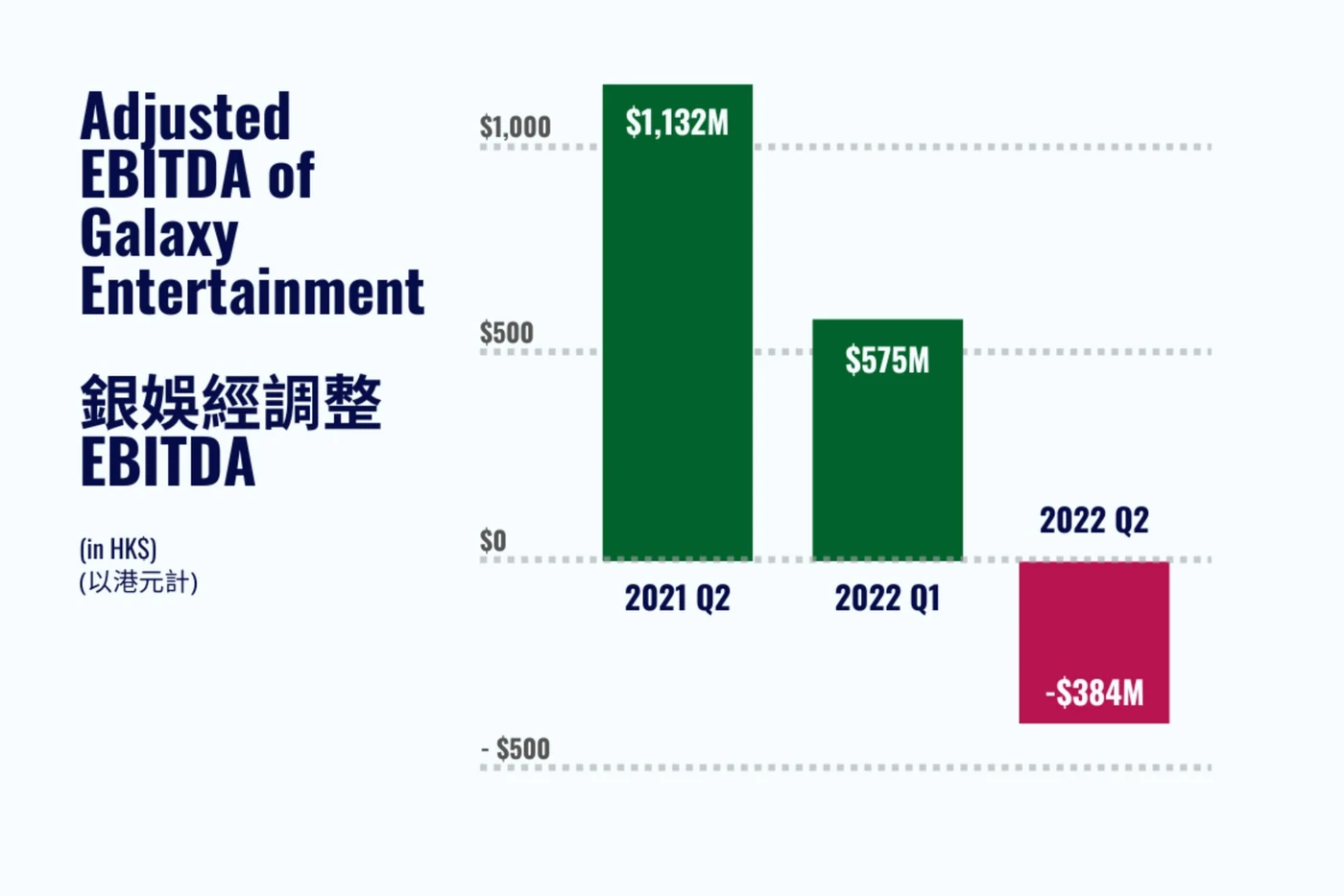
The total—Adjusted EBITDA by quarter—is a simple bar chart once it's on its own: three bars, one figure each, positive and negative distinguished by colour. Galaxy's own presentation used accounting-style parentheses to mark negative numbers, which is standard on a financial statement but less immediately legible to a general audience than colour paired with a minus sign.
06 Six business units, three quarters
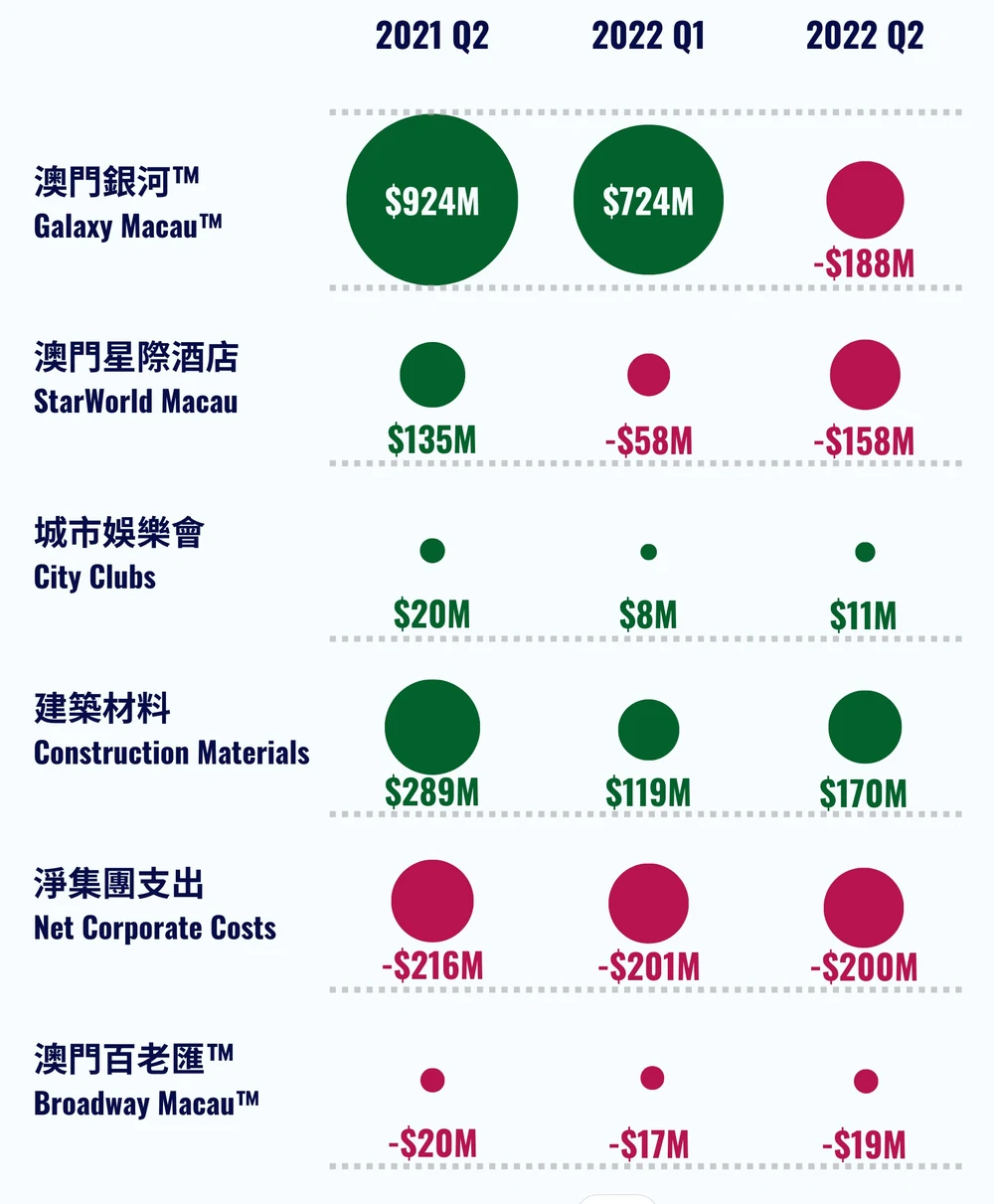
That leaves the breakdown: six business units, each with its own Adjusted EBITDA across three quarters. A stacked bar chart is out, for the reasons above. What else is on the table?
First, a single large chart isn't the only option. It's easy to fall into the habit of selecting an entire table in Excel and clicking "Chart"—but sparklines, small chart-like figures without axes, have become common precisely as an alternative to one big chart trying to hold everything. Excel supports them natively, and they're a straightforward way to show several small data stories side by side instead of one crowded one.
Second, a sparkline could use bars—but we'd already used bar shapes for the total chart above, so we wanted a different shape here to keep the two visually distinct. A line chart is normally the default choice for showing change over a few quarters, but Galaxy's six business units span wildly different scales: City Clubs and Broadway™ are tiny next to Galaxy Macau™. Force everything onto one shared scale and the smaller units flatten into what looks like a flat line near zero. Give each its own scale and you risk exaggerating small movements into something that looks dramatic.
07 Why we reached for circles instead
Our answer was to break from a standard chart type and use circle area to represent each figure's size, coloured green for positive and a shade of red for negative. That lets a reader see both the relative scale of each business unit and whether it's profitable at a glance, without a shared axis forcing every unit onto the same scale.
One more option worth naming for a single quarter rather than three: the waterfall chart, increasingly popular for exactly this kind of "how did we get from one total to another" story. That's a chart worth its own dedicated write-up—we'll save it for a future piece.
More from the studio


Send it our way
Rough draft, messy spreadsheet, or a chart you inherited and don't quite trust—we're glad to take a look.
Get in touch