

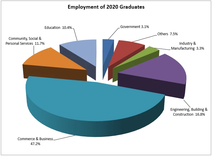
Hong Kong's Joint University Programmes Admissions System (JUPAS) publishes a pie chart showing where City University's 2020 graduates ended up working. It's colourful, it's tilted into 3D, and it takes up most of the page—but to actually understand it, a reader still has to work through the small black labels scattered around the edge. At that point, a plain table would do the job faster.
Still, most of us don't always get to choose the chart. If your boss or professor has decided it has to be a pie chart, here's how we'd approach drawing one well.
01 Fighting the one thing a pie chart is for
A chart's job is to let you compare things visually before you ever read a number. That's exactly what a pie chart is supposed to make effortless: glance at two wedges, and get a rough sense of which is bigger, without doing arithmetic.
Tilting that pie into three dimensions works directly against this. Our sense of proportion is tuned for flat shapes—circles and angles on a plane. Add a fake perspective and the wedges nearest the "camera" look larger than equal-sized wedges further away, purely because of the tilt. You end up doing more mental correction, not less. If a chart can be drawn flat, it almost always should be; 3D rarely earns its place. It persists mostly because it's one click away in Microsoft Office, and because a spinning 3D chart still reads as more impressive than a flat one to a lot of audiences.
02 Exploding every slice removes the emphasis it's meant to add
The original chart also pulls every single wedge away from the centre, so the whole pie looks like it's mid-explosion. Pulling a slice away from the centre is normally a highlighting device—it tells the reader "look at this one in particular," usually paired with a distinct colour. Do it to every wedge at once and the technique cancels itself out: nothing is emphasised, because everything is. All it really communicates is "this is a 3D chart," which isn't information the reader needed.
03 The donut fix, and why it's often the friendlier default now
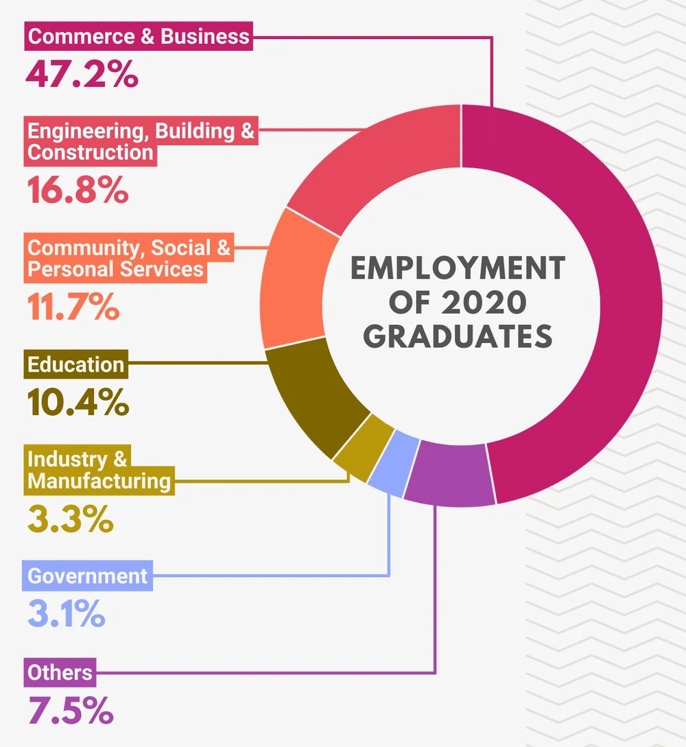
For showing a breakdown of percentages, we increasingly reach for a donut chart instead of a pie. Part of the reason is simply that a circle is a rigid shape to design with—stretch it and it becomes an oval, which usually looks like a mistake rather than a choice. A donut gives you one extra degree of freedom: you can set the thickness of the ring itself, which a solid pie can't offer.
The more useful reason is the hole in the middle. It's free real estate. Instead of a title floating somewhere above or beside the chart, you can put the chart's subject directly at its centre, so the label and the shape become one visual unit rather than two things a reader has to connect themselves.
04 There's no official rule for ordering the wedges—but there's a good convention
Bar charts have familiar ordering conventions: largest to smallest, or left to right by category. Pie and donut charts are murkier—should wedges run clockwise or counter-clockwise, and where should the first one start? There's no single agreed answer, but our favourite treatment of the question comes from Dona Wong's The Wall Street Journal Guide to Information Graphics, a genuine classic on the subject.
Picture the chart as a clock face. Place the largest wedge starting at 12 and running clockwise. Then place the second-largest, third-largest, and so on going counter-clockwise from 12, largest to smallest. The payoff: your two biggest categories end up sitting immediately on either side of 12 o'clock, so a reader spots the top two at a glance without needing to read a single label.
05 Where the labels and colour go
Pie chart labels usually get scattered around the outside edge, wherever there happens to be room. For this particular chart, we found it more useful to break that convention: list every category in size order along one side, in a single column. The order becomes information in its own right—readers can see the ranking without comparing wedge angles by eye at all. We labelled each one clearly rather than relying on a small coloured dot alone, since the category name carries as much weight as its share.
For colour, we skipped the Office default palette entirely. City University's own brand colour—a specific magenta-pink—was the obvious starting point, so we ran it through a palette generator (mycolor.space is a simple, free option) to build a consistent family of tints and shades, rather than hand-picking hues one at a time from a colour wheel. Because every wedge comes from the same colour family, we added a thin background-coloured stroke between segments so neighbouring wedges in similar shades don't visually bleed into one another.
06 Is a pie chart even the right choice?
After all the technique above, it's worth asking the more basic question. Percentages alone hide the actual headcounts behind them—47.2% could be 47 graduates or 4,700. If the real figures were available, we'd rather put the total graduate count in the donut's centre instead of just a title, and adjust the wording slightly so the number does some of the work.
It's also worth remembering that a percentage breakdown isn't automatically the most important way to look at this data. The number of City University graduates actually working in each field is arguably just as interesting as the share—and that's a story a pictogram, with one icon standing in for a set number of graduates per field, might tell more plainly than any pie or donut chart could. Which chart type actually fits the question is a decision worth making before you open the chart menu, not after.
More from the studio


Send it our way
Rough draft, messy spreadsheet, or a chart you inherited and don't quite trust—we're glad to take a look.
Get in touch