

In an earlier piece, we redesigned a single chart from an overseas-listed conglomerate's results presentation and talked through how we'd approach PowerPoint design more generally. The response was good enough that this time we didn't stop at one page. We picked the interim results presentation from NWS Holdings' FY2023 analyst deck—over 30 pages long—and rebuilt the first five.
We chose this particular deck because the content itself was already strong: substantive, clearly worded, logically ordered. It didn't need a rewrite. It needed design that matched the quality of the writing.
01 Consistency isn't just fonts and colours
Looking professional in PowerPoint starts with going beyond PowerPoint's own default template—something any secondary school student can technically do. That's exactly why large companies keep a proper design guide on top of their template file: one that doesn't just specify a font and a background colour, but spells out every design element and when to use it.
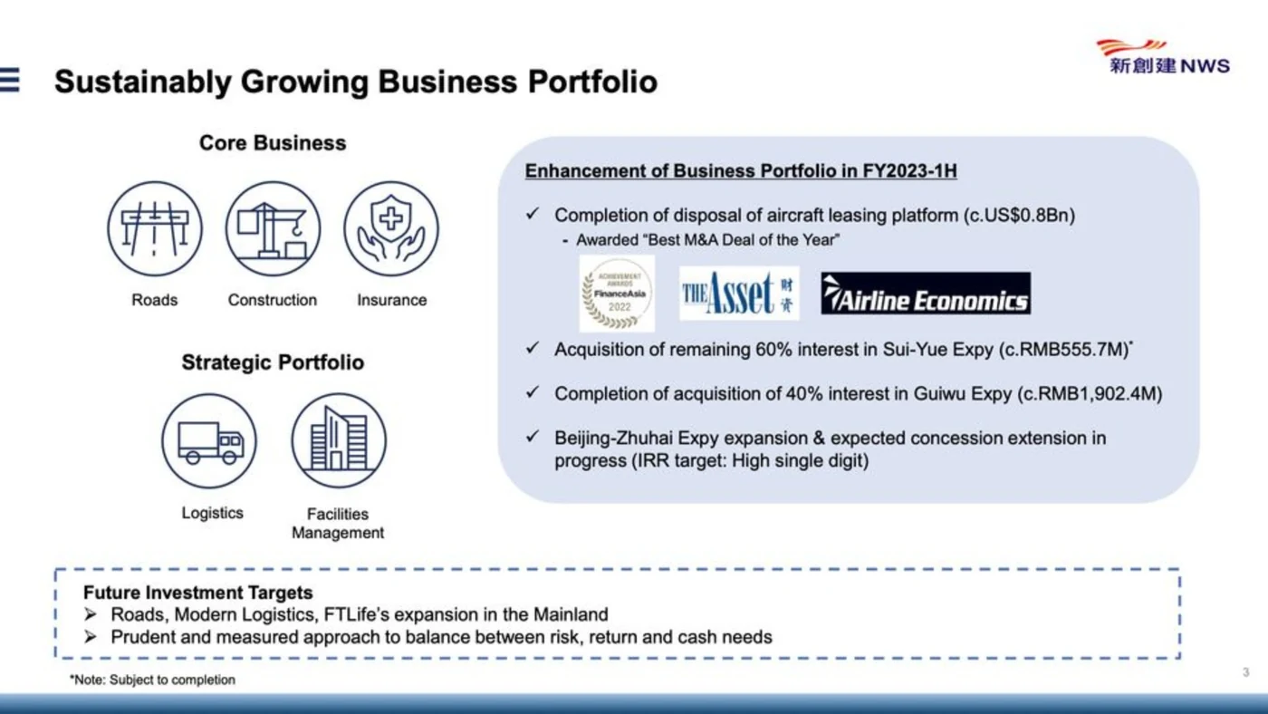
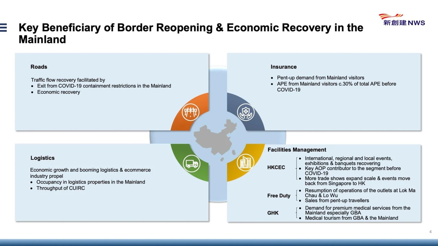
The deck we picked does use a template, but doesn't apply it consistently page to page. On the slide we redesigned, the top-right corner sits on a pale blue rounded rectangle—with a corner radius a little too generous—while the bottom of the same page uses a dashed-border rectangle instead. There's no visible logic for switching between the two. The next page introduces four more pale blue rectangles in a different shade, with a drop-shadow effect that hadn't appeared anywhere before, plus icons in orange, navy, dark green, and yellow that don't appear elsewhere in the deck either—all, notably, straight from PowerPoint's default colour set. None of these choices is wrong in isolation. Together, with no evident reasoning, they just read as inconsistent.
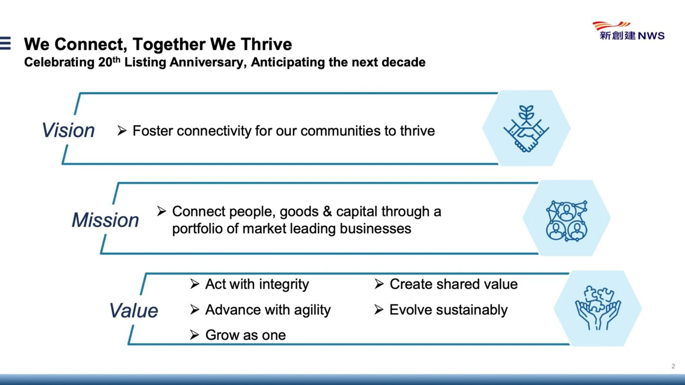
Bullet symbols tell the same story. One page uses an arrow (➢)—a very on-brand, very Microsoft-default choice. The next switches to a checkmark (✓). The one after that uses a plain dot. A later page returns to the arrow. Nothing marks these as different types of content; they just look like different people built each page and never compared notes before stitching them together.
02 What actually makes a deck look amateur
Beyond page-to-page consistency, a few specific habits are responsible for most of what reads as "amateur" in a PowerPoint deck. It's rarely the font choice itself—outside of Comic Sans, most Office default fonts, Arial included, are perfectly fine. The real culprits:
- Bold, italic, and underline stacked together for no reason. All three have existed as text effects since Office's earliest days, and using two or three of them on the same text is a near-certain tell. Bold has an obvious job: titles and subtitles. Italic and underline both have legitimate uses, but "I wanted this bit to look different" isn't one of them. On one slide, three company values—Vision, Mission, Value—were simply set in italics for emphasis. There are better tools for that job than Shift+I.
- A bullet symbol chosen without thinking about the typeface. That arrow symbol (➢) usually isn't the right call for slide bullets unless your body font is a serif face—something like Times New Roman, with small decorative strokes at the end of each letter. It reads more at home in a formal Word document than on a slide.
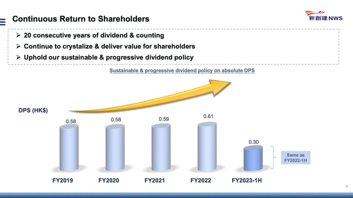
- 3D charts. Almost no 3D chart earns its place. The third dimension rarely helps a chart communicate anything more clearly—it's usually chosen purely to look more polished, and it often works against the page instead. One page's chart, rendered in 3D, sat awkwardly against the rest of the layout and undercut the three points that page was trying to make.
- Piling on effects without a reason. Adding more visual effects in PowerPoint is genuinely tempting, especially for beginners—but every one needs a reason, and needs to stay consistent from page to page. Shadows, reflections, glow, 3D, and borders are all usable; a large yellow arrow graphic on one slide is a good example of an effect that shows up once, unexplained, and never again.
03 A colour theme, chosen on purpose
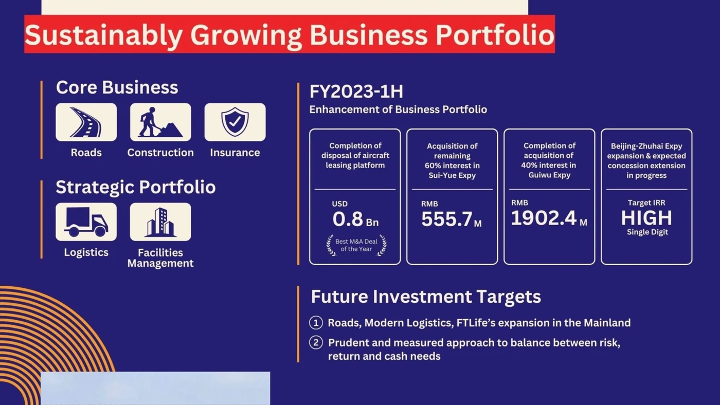
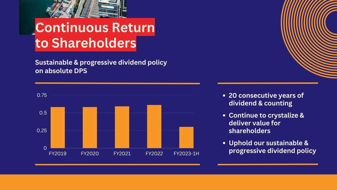
Our redesign leans on the company's own brand colours—vivid orange and purple pulled directly from its logo—used with more energy and motion than the original deck. Every page title sits in white text on a bright red background block, so the title is always the first thing a reader's eye lands on. Does a non-white background read as less professional? Not inherently—plenty of major international annual reports use bold or dark backgrounds throughout. What matters is that the choice is deliberate and consistent, not that it's white.
04 Deciding what readers see first
This was the single most important decision in the redesign. For any visual design, one of the biggest questions is simply: what does the audience see first, and what comes after that? Using type size and colour, we made sure the most important information—the page title—is the easiest thing to spot, followed by the subtitle, then the body content.
On one page, we enlarged the icons so the three-part structure of the content is obvious at a glance, without needing each supporting point blown up to match. On another, we regrouped the layout: a list of initiatives already completed and a list of future targets are really the same kind of information—one finished, one upcoming—so we aligned both to the same side of the page instead of scattering them. On a third page, we dropped a four-pillar circular icon layout entirely. On its own, that layout was clear enough. But elsewhere in the deck, the same business was sometimes grouped into three segments and sometimes into five—so in the interest of consistency, we simplified rather than keep a treatment that only worked in isolation.
05 Making space for white space
A small thing with an outsized effect: we didn't try to fill every inch of every page. It's fine to leave space unused. If bare space starts to feel monotonous, a simple decorative line pattern can fill it while reinforcing consistency across the deck—we used a repeating arc motif throughout. Ideally, a pattern like that would echo something from the brand itself; the company's own logo uses a wave motif that would have tied in even more directly, though we didn't use it here for licensing reasons.
06 Cutting every unnecessary effect
No 3D. No italics or underlines added just because. No shadows or dashed borders without a clear, repeated reason. Every page holds to the same visual rules as the one before it.
Here is the result of applying those principles to the first five pages. The pages are stacked edge to edge on purpose, the way they read when you scroll the PDF.



07 Designing for the PDF, not just the room
In almost every modern workplace or classroom, whoever presents after a meeting is expected to share the deck afterward—and sharing a PDF is far more common, and safer, than sharing the editable file. People who attended may revisit it; people who weren't fully present, or missed the meeting entirely, will read the PDF to catch up. NWS's own interim results deck is posted publicly online for exactly this reason. Designing only for the room misses this second audience entirely.
In our redesign, photos and design elements deliberately cross page boundaries, so pages feel visually connected rather than repeating the same static template over and over. The photo at the top of page two, for instance, continues directly from the photo used on page one. Opened as a PDF and scrolled top to bottom, the deck reads a little like a webpage—each page distinct enough to stand alone if presented live, but also part of one continuous flow for anyone reading start to finish afterward.
We picked this particular report to redesign for one reason: the underlying content was already good. It just needed design that matched. If there's a chart, a slide, or a report you'd like to see get the same treatment, we're always glad to hear suggestions.
Before and after

More from the studio


Send it our way
Rough draft, messy spreadsheet, or a deck you inherited and don't quite trust—we're glad to take a look.
Get in touch