

Plenty of private companies hold their printed books and flyers to strict design standards. Presentations are different. Even when a company has a template, it rarely comes with detailed standards, so chart design quickly slips back to Microsoft Office defaults.
To show how a company deck's charts could do better, we picked Orient Overseas (International) Limited's 2022 interim results presentation, which OOIL makes publicly available to download from its website.
01 A template for the deck, but not for the charts
OOIL's deck is simple, but it clearly uses a template. The typeface isn't a Microsoft Office default (nor a system Chinese font like PMingLiU), and every page's title and footer are tidy and consistent. The style isn't flashy, but consistency always reads as professional.
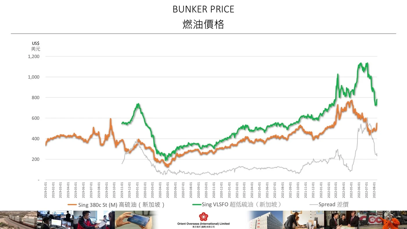
The catch is that the company seems to have used the template and stopped there. There are no detailed style rules behind it, so body colours and chart formatting look fairly arbitrary. We focused on page 9: the bunker (fuel) price chart.
02 Start by understanding what the chart is for
This deck was probably presented live at a shareholder meeting, which is why the page holds a single chart and no explanatory text. Before redesigning anything, we needed to know what the chart was trying to say, so we went back to OOIL's written interim report. It says that during the period, oil prices generally rose and pushed fuel costs up.
So the chart is really making one point: fuel in the first half of 2022 cost far more than a year earlier, and prices were still swinging widely. With that, we had enough to redesign.
03 Simplify the data to serve the message
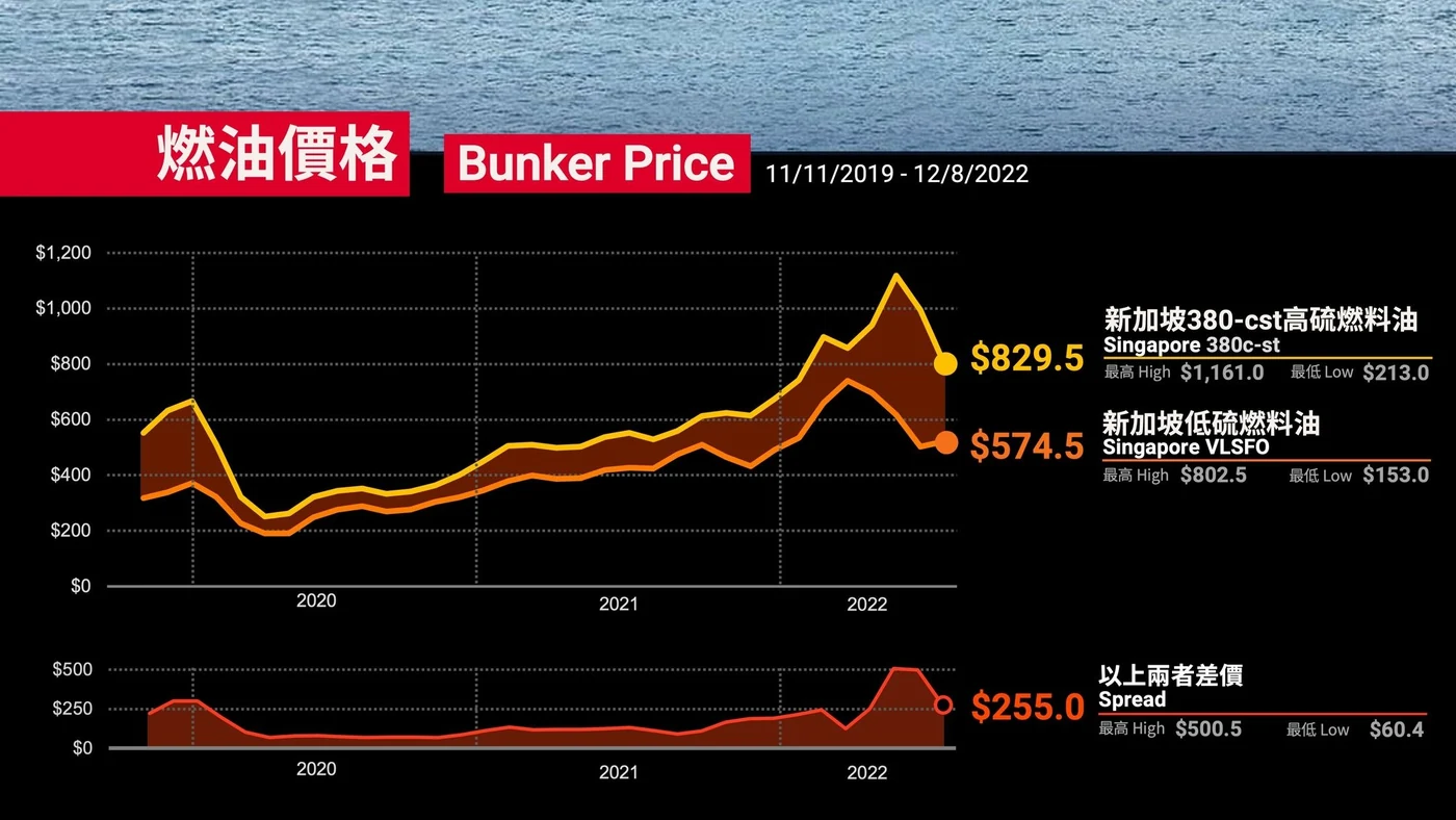
The chart runs from January 2019 to August 2022 and plots two kinds of fuel. The first thing a reader wonders is why the green line is missing its first ten months, with only an orange line for January to October 2019. Nobody made a mistake: very-low-sulphur fuel oil (VLSFO) only has data from November 2019. Those early 2019 prices are more volatile, but they matter little to a 2022 interim report, and dropping them still shows the rise clearly. To remove needless questions and keep readers on the point, the chart can start from 2020 or 2021. Our version starts in November 2019, where both fuels have data, so both lines begin together.
Dates need care too. The original writes the year, month and day vertically under every month, which is hard to read. Keep date labels horizontal, mark them once a year or once every half year, and add vertical gridlines to separate the periods.
Then there's data frequency. When you plot two years of prices, should each point be an hour, a day, a week or a month? Many people assume more data is better, but for a long-term trend, points that are too dense stop adding meaning. Stock charts from Google or Yahoo adjust the frequency automatically to the time range you pick, and for two or five years, weekly prices are usually enough.
On the design side, the legend sits too close to the footer and is hard to notice. It should sit where readers can find it. Finally, the price lines carry a shadow effect. Shadow is one of the most overused Office effects. Its proper job is to lift a piece of text or a shape off its background, showing it is on a different layer, like windows stacked on a computer desktop. All the information in one chart sits on the same plane, so nothing here should cast a shadow.
04 How do you show the spread?
What makes this chart unusual is its grey line: the price gap, or spread, between high-sulphur fuel and VLSFO. Why does the gap matter? Again we had to look it up. Since 2020, the International Maritime Organization has capped sulphur in ship fuel, so many carriers, OOIL among them, must burn the more expensive VLSFO. Higher oil prices already push up shipping costs. The spread between the two fuels is the extra cost that comes from the environmental sulphur limit. Now we understood the message behind the data and could start designing.
The two price lines are already plenty for a reader to digest, so we take it step by step. First, a chart of high-sulphur and VLSFO prices. Once readers know there are two fuels, they are ready for the second layer of information, the spread between them, which we suggest putting in its own chart. The key is how to connect two different charts:
- Colour the gap. In the first chart, fill the area between the two lines. The coloured area is the spread.
- Repeat the colour. Draw the spread as an area chart in the same colour, so the eye links the two right away.
- Stack them with one time axis. Place the charts one above the other so the dates line up.
Readers now see the two fuel-price trends first, which show the cost pressure of rising oil prices. Then they see the gap between them, the extra cost added by the sulphur cap.
To fit the report's message more closely, we added the highest and lowest prices as text, which puts the size of the swings up front. We also considered marking the highs and lows directly on the chart, but the dates they happened on aren't the point, so we left that out.
05 Going further: don't use the same template on every page
Like OOIL's, many decks are uploaded as PDFs or emailed after the meeting for readers or investors to look through. A deck isn't only for live explaining. It also has to work on screen.
To make the company template more interesting, our example uses elements that carry across pages. The top of the second slide continues the photo of the ship on the slide before, and the "Bunker Price" title spans both the sea and the data background. We use the same continuous device in our Instagram posts, and big media like Bloomberg use similar designs in theirs. Scrolling down the PDF feels more connected, and more fun.

06 Light or dark background?
One question comes up all the time when designing a deck: is a light or a dark background better? If print isn't a concern, data charts usually work best on dark or black. A dark base makes colours stand out and raises the contrast, so data reads more directly and is easier to understand. The Wall Street Journal's stock price charts are a good example.
These days, at work or at school, most charts end up in presentations. Chart design and deck design are closely tied, and we took the second half of that story further in a follow-up: a results deck redesigned for life after the meeting.
More from the studio


Send it our way
Rough draft, messy spreadsheet, or a deck you inherited and don't quite trust—we're glad to take a look.
Get in touch